Vernacular Baton Rouge
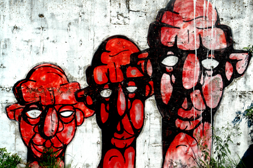
We in graphic design call the graffiti and hand painted signage of a given area “the vernacular.” And I have been impressed for years by the vernacular here in Baton Rouge. I don’t know how many times I’ve said to myself “I should take a picture of that.” So here it is, the first in a series. These unsigned heads face River Road just south of the I-10 bridge.
the full moon
“‘So there was a old woman told my mammy once that if a woman showed her belly to the full moon after she had done caught, it would be a gal.’”
—William Faulkner, Spotted Horses, 1940.
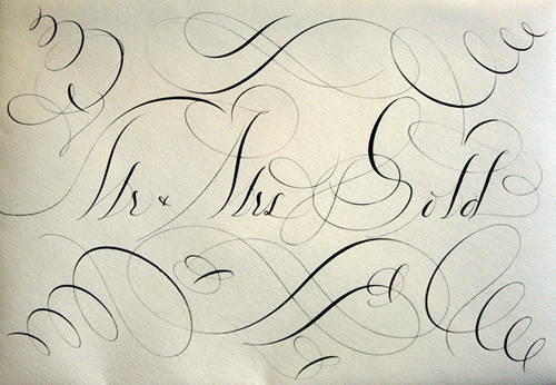
Bernard Maisner
Niels “Shoe” Meulman
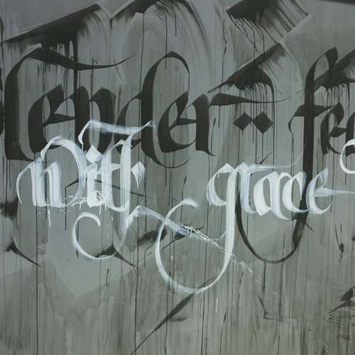
Niels “Shoe” Meulman is a Dutch graffiti artist, graphic designer, and calligrapher. He started tagging at the age of 16. Now he’s 40 and his work is amazing. Click here to see his portfolio, which is worth checking out. And click here to watch a four-part interview with him on YouTube.
The Caroline miniscule
“Although by some reports he was illiterate except to sign his name, Charlemagne fostered a revival of learning and the arts. The England of the 700s had seen much intellectual activity, and Charlemagne recruited the English scholar Alcuin of York to come to his palace at Aachen and establish a school. . . . Many manuscripts were difficult, if not impossible, to read. Charlemagne mandated reform by royal edict in A.D. 789. . . .
Efforts to reform the alphabet succeeded. For a model, the ordinary writing script of the late antique period was selected [and] combined with Celtic innovations, including the use of four guidelines, ascenders, and descenders. . . . The Caroline miniscule is the forerunner of our contemporary lowercase alphabet. . . . Roman capitals were studied and adopted for headings and initials. . . . The use of a dual alphabet was not fully developed in the sense that we use capital and small letters today, but a process in that direction had begun.”
—Phil Meggs & Alston Purvis, Meggs’ History of Graphic Design, 2006.
The codex
“The codex, a revolutionary design format, began to suplant the scroll (called a rotulus) in Rome and Greece, beginning about the time of Christ. Parchment was gathered in signatures of two, four or eight sheets. These were folded, stitched, and combined into codices with pages like a modern book. . . .
Christians sought the codex format to distance themselves from the pagan scroll; pagans clung to their scrolls in resistance to Christianity. Graphic format thereby became a symbol of religious belief during the late decades of the Roman Empire.”
—Phil Meggs & Alston Purvis, Meggs’ History of Graphic Design, 2006.
The Latin alphabet
“The Latin alphabet came to the Romans from Greece by way of the ancient Etruscans, a people whose civilization on the Italian peninsula reached its height during the sixth century B.C. After the letter G was designed by one Spurius Carvilius (c. 250 B.C.) to replace the greek letter Z (zeta), which was of little value to the Romans, the Latin alphabet contained twenty-one letters: A, B, C, D, E, F, G, H, I, K, L, M, N, O, P, Q, R (which evolved as a variant of P), S, T, V, and X. Following the Roman conquest of Greece during the first century B.C., the Greek letters Y and Z were added to the end of the Latin alphabet because the Romans were appropriating Greek words containing these sounds. . . .
Roman inscriptions were designed for great beauty and permanence. The simple geometric lines of the capitalis monumentalis (monumental capitals) were drawn in thick and thin strokes, with organically unified straight and curved lines. Each letterform was designed to become one form rather than merely the sum of its parts. Careful attention was given to the shapes of spaces inside and between the letters. . . .
Regardless of which tool initiated the serif as a design element, we do know that the original letters were drawn on the stone with a brush and then carved into it. The shapes and forms defy mathematical analysis or geometrical construction. . . . Some Roman Inscriptions . . . contain minute particles of red paint that have adhered to the stone through the centuries, leaving little doubt that the carved letters were painted with red pigment.”
—Phil Meggs & Alston Purvis, Meggs’ History of Graphic Design, 2006.
art forms of great harmony and beauty
“The Phoenician alphabet was adopted by the ancient Greeks and spreak through their city-states around 1000 B.C. . . . The Greeks took the Phoenician or North Semitic alphabet and changed five consonants to vowels. . . . .
From a graphic design standpoint, the Greeks applied geometric structure and order to the uneven Phoenician characters, converting them into art forms of great harmony and beauty. The written form of Greek . . . has a visual order and balance as the letters move along a baseline in an even repetition of form and space. The letters and their component strokes are somewhat standardized because a system of horizontal, vertical, curved, and diagonal strokes is used. In the inscriptional form, the letters became symmetrical geometric constructions. . . . [M]any letterforms, including the E and M, are based on a square, A is constructed from an equilateral triangle, and the design of the O is a near-perfect circle.
Initially the Greeks adopted the Phoenician style of writing from right to left. Later they developed a writing method called boustrophedon, from the words meaning ‘to plow a field with an ox,’ for every other line reads in the opposite direction. Line one reads from right to left; then the characters do an about-face, and line two reads from left to right. . . . Finally the Greeks adopted the left-to-right reading movement that continues to this day in Western civilization.”
—Phil Meggs & Alston Purvis, Meggs’ History of Graphic Design, 2006.
North Semitic writing
“While the alphabet’s inventors are unknown, Northwest semitic peoples of the western Mediterranean region—early Canaanites, Hebrews, and Phoenicians—are widely believed to be the source. The term North Semitic writing is used for early alphabetic writing found theoughout this region. Because the earliest surviving examples are from ancient Phoenicia . . . these early scripts are often called the Phoenician alphabet. During the second millennium B.C. the Phoenicians became seafaring merchants. Their sailing ships, the fastest and best engineered in the ancient world, linked settlements throughout the Medterranean region. Influences and ideas were absorbed from other areas, including Egypt and Mesopotamia. . . .
The Phoenicians absorbed cuneiform from Mesopotamia in the west and Egyptian hieroglyphics and scripts from the south. Possibly they had knowledge of Cretan pictographs and scripts and may have been influenced by them. . . .
The writing exported by the Phoenicians, a totally abstract and alphabetical system of twenty-two characters was in use by 1500 B.C.
Although North Semitic writing is the historical beginning of the alphabet, it may have descended from an earlier, lost prototype. Early alphabets branched into multiple directions, including the Phoenician alphabet that evolved further in Greece and Rome, as well as the Aramaic alphabet, which gave rise to Hebrew and Arabic writing elsewhere in the region.”
—Phil Meggs & Alston Purvis, Meggs’ History of Graphic Design, 2006.
the evolution of funerary texts
“The Book of the Dead was a third phase in the evolution of funerary texts. Beginning with the pyramid of Unas (c. 2345 B.C.), the walls and passages of the pyramids were covered with the pyramid texts of hieroglyphic writings, including myths, hymns, and prayers relating to the godlike pharaoh’s life in the afterworld. This practice was followed by the coffin texts. All surfaces of the wooden coffin and/or stone sarcophagus were covered with writings and often illustrated with pictures of possessions for use in the afterlife. Thus, high officials and noblemen could enjoy the benefits of funerary texts even though the cost of a pyramid was beyond their means.
The dawning of the New Kingdom, around 1580 B.C., saw papyrus manuscripts come into use for funerary texts. Even citizens of fairly limited means could afford to have at least simple papyri to accomany them on the journey into the afterlife. From pyramid to coffin to papyri—this evolution toward cheaper and more widespread use of funerary texts paralleled the increasingly democratic and secular aspects of Egyptian life.”
—Phil Meggs & Alston Purvis, Meggs’ History of Graphic Design, 2006.