Words forming thought and vice versa

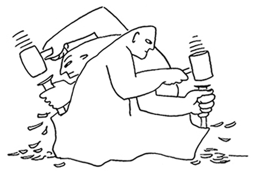
Words forming thought and vice versa, an illustration from Language in Thought & Action by S.I. Hayakawa, 1940.
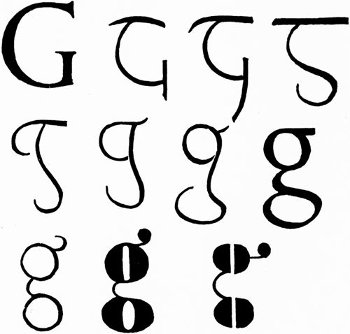
A pair of spectacles is rather like a g

“Figure
3 (1-8) shows the evolution of the lower-case g from the Roman
original. 9-11 are comic modern varieties having more relation to pairs
of spectacles than to lettering—as though the designer had said: A pair
of spectacles is rather like a g; I will make a g rather like a pair of
spectacles.”
—Eric Gill, An Essay on Typography, 1936.
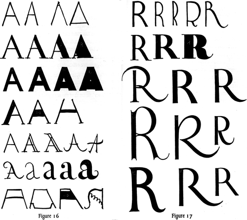
When is an A not an A?
 “Everybody thinks that he knows an A when he sees it; but only the few
extraordinary rational minds can distinguish between a good one & a
bad one, or can demonstrate precisely what constitutes A-ness. When is
an A not an A? Or when is an R not an R? It is clear that for any
letter there is some sort of norm. To discover this norm is obviously
the first thing to be done.”
—Eric Gill, An Essay On Typography, 1936.
a luxury market
“The traditional use of red for the commentary and ritual directions in ecclesiastical books and for the initial letters of more important passages is a reliable precedent where the customer is able to pay for it. At the present time only a few rich enthusiasts are prepared for such expense, with the consequence that such rubricating is only done in books printed for what may be called a luxury market.”
—Eric Gill, An Essay On Typography, 1936.
[T]he business of printed lettering
“[T]he business of printed lettering has, under the spur of commercial competition, got altogether out of hand and gone mad. There are now about as many different varieties of letters as there are different kinds of fools. I myself am responsible for designing five different sorts of sans-serif letters—each one thicker and fatter than the last because every advertisement has to try and shout down its neighbors.”
—Eric Gill, An Essay On Typography, 1936.
a curious mixture of azure and mother-of-pearl
The colors are inside our brains
“A mysterious aspect of color is that it is created in the brain and seen to exist in the physical environment. But the physical environment contains only light waves and is in fact colorless. The colors are inside our brains, not outside.”
HIGH PRIORITY
seeing letters in color
“[T]he most commonly reported type of synesthesia is hearing or seeing letters in color. Vowels, and often consonants, too, have very specific—and fixed—colors for the synesthetes who see letters in color. For the synesthete Katinka Regtien, for example, the vowel E is not simply red but a specific translucent red with a hint of orange. . . .
the Glass Bead Game
“[The] rules, the sign language and grammar of the Game, constitute a kind of highly developed secret language drawing upon several sciences and arts, but especially mathematics and music (and/or musicology), and capable of expressing and establishing interrelationships between the content and conclusions of nearly all scholarly disciplines. The Glass Bead Game is thus a mode of playing with the total contents and values of our culture; it plays them as, say, in the great age of the arts a painter might have played with the colors on his palette. All the insights, noble thoughts, and works of art that the human race has produced in its creative eras, all that subsequent periods of scholarly study have reduced to concepts and converted into intellectual property—on all this immense body of intellectual values the Glass Bead Game player plays like the organist on an organ.”
—Hermann Hesse, The Glass Bead Game (Magister Ludi), 1943.
