Old Semitic
”[A]s far as can be ascertained from the available records, the
principle of alphabetic writing has only been discovered once—hence, in
the whole world there is only one alphabet. . . . [A]ny people which
writes in alphabetic signs has learned and adapted the use of the
alphabet from another people who, in turn, had done the same. . . .
The earliest preserved inscriptions in alphabetic script date to about 1725 B.C. and were found in and around Byblos, in the country then known as Phoenicia (now Lebanon). It would seem that an alphabetic script which we might call Old Semitic was fairly familiar in that region at that time. . . .
This Old Semitic alphabet is of course the ancestor of the Hebrew, Phoenician, and Aramaic systems of writing. From these northern Semites, the knowledge of the alphabet appears to have passed, on the one hand, to the Greeks of Asia Minor, and on the other, to the Brahmans of ancient India, who developed from it their devanagari, the sacred script in which the religious rituals and hymns of the ancient Hindus were recorded.”
—John P. Hughes, The Science of Language, 1962.
a dome of blending tints
“The sky too has its changes. . . . Clouds map it up at times, but it is normally a dome of blending tints, and the main tint blue. By day the blue will pale down into white where it touches the white of the land, after sunset it has a new circumference—orange, melting upwards into tenderest purple. But the core of blue persists, and so it is by night. Then the stars hang like lamps from the immense vault.”
—E.M. Forster, A Passage to India, 1924.
A little green bird
“A little green bird was observing her, so brilliant and neat that it might have hopped straight out of a shop. On catching her eye it closed its own, gave a small skip and prepared to go to bed. Some Indian wild bird. . . .
‘Do you know what the name of that green bird up above us is?’ she asked, putting her shoulder rather nearer to his.
‘Bee-eater.’
‘Oh no, Ronny, it has red bars on its wings.’
‘Parrot,’ he hazarded.
‘Good gracious no.’
The bird in question dived into the dome of the tree. It was of no importance, yet they would have liked to identify it, it would somehow have solaced their hearts. But nothing in India is identifiable, the mere asking of a question causes it to disappear or to merge in something else.”
—E.M. Forster, A Passage to India, 1924.
the colour of their skins
“When they argued about it something racial intruded—not bitterly, but inevitably, like the colour of their skins: coffee-colour versus pinko-grey.”
—E.M. Forster, A Passage to India, 1924.
the height of impropriety
“The remark that did him the most harm at the club was a silly aside to the effect that the so-called white races are really pinko-grey. He only said this to be cheery, he did not realize that ‘white’ has no more to do with a colour than ‘God save the King’ with a god, and that it is the height of impropriety to consider what it does connote. The pinko-grey male whom he addressed was subtly scandalized; his sense of insecurity was awoken, and he communicated it to the rest of the herd.”
—E.M. Forster, A Passage to India, 1924.
my collection
My art. Not the art that I’ve created, but the art that I own. Art that I liked enough to pay for. Well . . . one of these was a gift, one them was purchased at art market prices, and the other purchased at a thrift store. I”m a thrift shopper . . . but the point is, this is all art that I like. Art is experience, not a market commodity. So, take a deep breath. Relax. And please enjoy a few paintings from my collection.
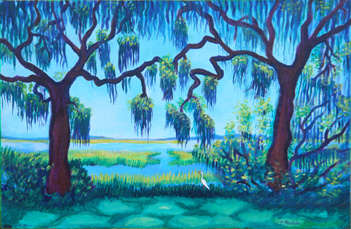 Charles Barbier, Marsh, 2005.
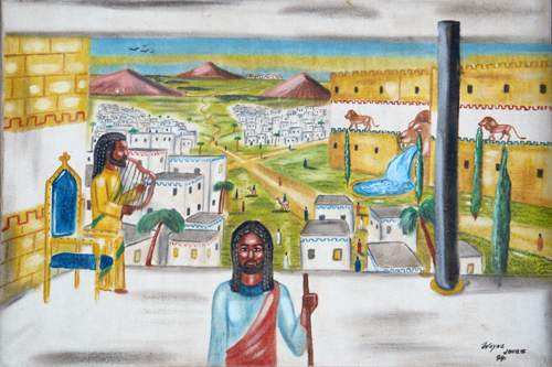 Wayne Jones, Untitled, 1994.
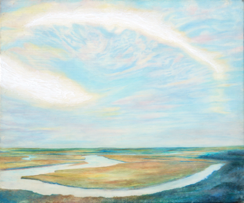
Jim Kellough, Old Bald Head, 2001.
How should ‘sans’ be pronounced?
I posted yesterday’s question on a graphic design educators listserv, and I have already received three great responses. My question hasn’t been directly answered (which means it’s a good question, rIght?) but I have learned a great deal. There is more to the words serif and sans-serif than you might have expected. If you’re interested in such things and you have some time, check out How should ‘sans’ be pronounced”, a lively discussion of the subject at Typophile.com.
the word ‘serif’
I have been researching typographic terminology for an article I plan
to submit to a number of on- and off-line publishing houses. (Was that
vague enough?) According to the Oxford English
Dictionary, famous for its exhaustive word histories, the word
‘serif’ was a back formation from the word ‘sans-serif’. In
other words, serif was not, as I have always assumed, a French word,
but rather a ‘faux-french’ word invented in England just after the
English invention of ‘sans-serif.
According to the OED, the
words were first recorded in print in 1830 (serif) and 1841
(sans-serif). So it seems that serif came first, right? No,
actually. They are so close to each other biblio-geologically that
apparently the invention of the word ‘sans-serif’ led quite nicely to
the invention of the word serif.
My question now is
this: if there was no word ‘serif’, what word was previously used, in
any language, to describe what my first type teacher, P. Lyn Middleton,
called ‘the little feet on the letters’? It’s almost impossible
to believe that no one ever mentioned them. Sans-serif Roman type was,
amazingly, not invented until the mid-nineteenth century. For nearly
2000 years, if you wrote with the Roman alphabet, the serif was
literally ubiquitous!
Burma-Vita
So, aside from, perhaps, the color red, what’s Burmese about Burma-Shave? Did I hear you ask? Well, as Leonard Odell tells it in Frank Rowsome’s book The Verse by the Side of the Road, Burma-Shave was preceded as a family enterprise by a liniment or topical health aid developed by his grandfather and named by his father:
“We called it Burma-Vita. Burma because most of the essential oils in the liniment came from the Malay peninsula and Burma, and Vita from the Latin for life and vigor—the whole name meaning Life from Burma.”
It is unclear whether any of these particular essential oils made it into the shaving cream knows as Burma-Shave, the result of over 300 chemical experiments, but as a prefix for a product name, Burma- was alive!
Burma-Shave
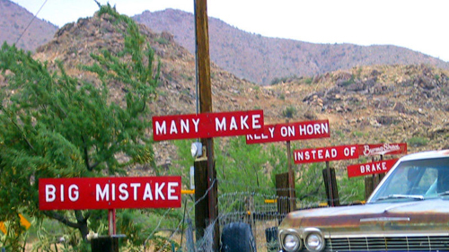
I don’t personally remember Burma-Shave signs; they were slightly before my time. But I’ve heard them mentioned from time to time and now I am researching all things Burmese for an upcoming lecture at school.
Burma-Shave signs were an advertising phenomenon, born as America’s highway system was growing. Rhyming sets of five painted boards with a kicker Burma-Shave logo on a sixth sign, they lined highways all over America through the 1930s, ’40s, and ’50s. The last of over 600 Burma-Shave jingles were posted in 1963.
Frank Rowsome Jr writes in his history of Burma-Shave signs, The Verse By the Side of the Road, “The signs themselves underwent continuous evolution. For the first five years they were one-inch pine boards, ten inches high and yard long, dip-painted twice with the background color mixed preservative. The lettering, a standard sign painter’s Gothic, was applied by silk screen. . . . To emphasize the new crop of jingles, signs alternated by years between red with white letterig and orange with black lettering. . . .
“Yearly alterations of color had seemed a good way to call attention to the new signs, but it was noticed that whenever people spoke of Burma-Shave signs, they invariably described them as red and white. Orange-and-black ones seem to have made no impression whatever on the public’s retina, or at least on its memory. At this the company gave up, going almost exclusively to red and white.”
Frank Rowsome Jr never mentions the original reason for the red and white color scheme, but a deep red is, unofficially, the national color of the country Burma (or Myanmar depending on which side of the political fence you’re on). But the red seemed right, to the designers of the original signs as well as the general public, which dismissed the orange signs as aberrations.