Op art . . . goes Pop art one better
“Op art . . . goes Pop art one better by being considerably more mindless.”
—Barbara Rose, in ArtForum International, 1965, quoted in Optic Nerve: Perceptual Art of the 1960s, by John Houston, 2007
a world beyond us
“[O]ptical art teaches its beholders a lesson taught by psychedelic
drugs at a considerably higher level of risk: it insists on the
absolute otherness of a world beyond us by dramatizing the threshhold
at which our ability to interpret that world begins to degrade and
disintegrate.”
—Dave Hickey, introduction to Optic Nerve: Perceptual Art of the 1960s, by John Houston, 2007.
WHAT IS REAL AND WHAT IS NOT?
Via NFG!
the glaring greenish-grey eye of Simon
“As by a fascination, every eye was now directed to the glaring greenish-grey eye of Simon.”
little golden stars twinkled through the glow
“It is now one of those intensely golden sunsets which kindles the
whole horizon into one blaze of glory, and makes the water another sky.
The lake lay in rosy or golden streaks, save where white-winged vessels
glided hither and thither, like so many spirits, and little golden
stars twinkled through the glow, and looked down at themselves as they
trembled in the water.”
still waters
like ingots of gold
“Having learned late in life, Tom was but a slow reader, and passed on laboriously from verse to verse. Fortunate for him was it that the book he was intent on was one which slow reading cannot injure—nay, one whose words, like ingots of gold, seem often to need to be weighed separately, that the mind may take in their priceless value.”
—Harriet Beecher Stowe, Uncle Tom’s Cabin, 1852.
GET A DUNE BUGGY
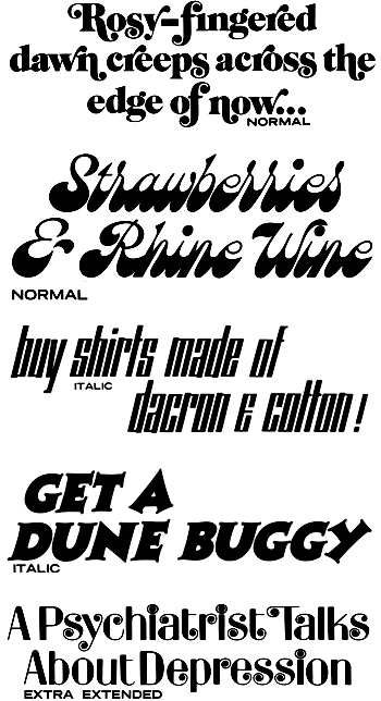
Some more type specimens from the 1969 LetterGraphics catalog of the previous post. The typefaces are Arriola Caslon Swash, Brandywine, Stein Long, Charlie Pointed, and, Spring. I particularly like the use of Spring in the faux-headline about depression. It’s a hopeful touch. I recognize a lot of the fonts in this catalog ffrom greeting cards; 1969 must have been a watershed year for greeting cards. If you consider that in 1969 Rod McKuen (available now in every thirft store) was by far America’s best-selling poet, it all starts to make a kind of crazy sense.
Young America does swing
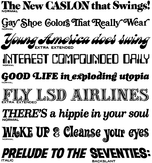
It’s the end of the semester, and on monday I ran into a pile of old books that were up for grabs before going into the trash. Imagine my astonishment as I opened a plain black three-ring binder and discovered New LetterGraphics Styles 1969, a type catalog from LetterGraphics of Culver City, California. It was disheveled and out of order, but I was looking at type specimens from 1969! Rock and roll!!!
Here, purely for your enjoyment, are some representative specimens. The fonts, from top to bottom, are Arriola Caslon, Bookman Bold Swash, Brandywine, Data Process, Cooper Italic Swash, Flair Lined Caps, Oxford Italic, Holiday and Manhattan.
a bang and a squiggle
“Victor Borge . . . suggests that conversation could be improved with audible punctuation—with pops, hisses, whistles, clicks, ticks, crackles, bangs and squiggles audibly punctuating our everyday speech! But as his act ends and the applause and laughter fade away you begin to realize that Borge . . . made a good point when he followed the sentence ‘Was I an idiot’ with a bang and a squiggle. . . . How often have we felt that need!? Or when the query is of greater stress than the emphasis, why not reverse the signals?!”
—Edward Rondthaler, Life with Letters, as they turned photogenic, 1981.