a Semicolon Appreciation Society
the punctuation mark of our era
“While the bullet point’s existence certainly predates PowerPoint, in popularity it is a curious byproduct of the computer program. Until recently it was merely a typographical mark, a solid dot, used in a particular kind of list, usually in an advertising context, to distinguish items of equal weighting. Typesetters would have created bullets by filling lower case o’s or by using various dingbats. Now, a plethora of Web sites exists to advise upon its usage: according to one, by adding emphasis to a list with bullets or icons (in PowerPoint you can select animated or sound ones) your list takes on new importance and invites readership. It has become an increasingly noisy sign that requests, with more urgency than a new paragraph can muster, the renewed and exaggerated attention of a reader: ‘Read This Now!’ it seems to demand. Despite the bullet’s mysterious past—in typographic histories its origins are either guessed at or omitted completely—and the fact that there is no bullet point button on the computer keyboard (it’s Option 8 on Macs and Alt-0149 on Windows); it has somehow finagled its way into popular usage to the extent that it is now the punctuation mark of our era.”
—Alice Twemlow, From the (A) Trivial to the (B) Deadly Serious, Lists Dominate Visual Culture, 2003; from Looking Closer Five: Critical Writings on Graphic Design, 2006.
The impatience of the digital reader
“Why . . . are readers on the Web less patient than readers of print? It is a common assumption that digital displays are inherently more difficult to read than ink on paper. Yet HCI [human-computer interaction] studies conducted in the late 1980’s proved that crisp black text on a white background can be read just as efficiently from a screen as from a printed page.
The impatience of the digital reader arises from cultural habit, not from the essential character of display technologies. Users of Web sites have different expectations than users of print. They expect to feel ‘productive,’ not contemplative. They expect to be in search mode, not processing mode. Users also expect to be disappointed, distracted, and delayed by false leads. These screen-based behaviors are driving changes in design for print, while at the same time affirming print’s role as a place where extended reading can still occur.”
—Ellen Lupton, The Birth of the User, 2004; from Looking Closer Five: Critical Writings on Graphic Design, 2006.
The beauty and wonder of ‘white space’
“The beauty and wonder of ‘white space’ is . . . [a] modernist myth that is under revision in the age of the user. Modern designers discovered that open space on a page can have as much physical presence as printed areas. White space is not always a mental kindness, however. Edward Tufte, a fierce advocate of visual density, argues for maximizing the amount of data conveyed on a single page or screen. In order to help readers make connections and comparisons as well as to find information quickly, a single surface packed with well-organized information is sometimes better than multiple pages with a lot of blank space. In typography, as in urban life, density invites intimate exchange among people and ideas.”
—Ellen Lupton, The Birth of the User, 2004; from Looking Closer Five: Critical Writings on Graphic Design, 2006.
Takashi Murakami
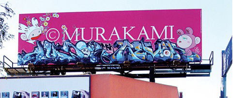
Takashi Murakami liked this modified billboard so much that he had it shipped to his studio in Tokyo. Via BoingBoing.
The exhibition, at The Museum of Contemporary Art, Los Angeles, is
over, but you can still take a tour of it, with Takashi himself as your
guide, here.
a digital scribbling democracy
“In the future graffiti, it turns out, may become a last bastion of free speech. Rules and regulations will be put in place, but graffiti will be an important tool, a digital scribbling democracy keeping the legislators in check.”
—Matt Mason, The Pirate’s Dilemma: How Youth Culture is Reinventing Capitalism, 2008.
CORNBREAD
“Back in the 1960s one of the earliest writers, CORNBREAD, tagged the Jackson 5’s 747 when the pop group made a stop in Philadelphia. . . .
CORNBREAD . . . was mistakenly reported shot dead in 1971 by local papers in Philadelphia. To prove he wasn’t, he broke into the Philadelphia Zoo and tagged both sides of an elephants behind with the words ‘CORNBREAD LIVES.’”
—Matt Mason, The Pirate’s Dilemma: How Youth Culture is Reinventing Capitalism, 2008.
o wall
“‘I am amazed, o wall, that you have not collapsed and fallen,’ reads an ancient wall in Pompeii, ’since you must bear the tedious stupidities of so many scrawlers.’”
—Matt Mason, The Pirate’s Dilemma: How Youth Culture is Reinventing Capitalism, 2008.
Obay
 Ask your parents if Obay is right for you. More information is available here, here, and here.
a huge synthetic, silver orb
“Our second act opens on a huge synthetic, silver orb floating in a cavernous black space. The orb is immensely powerful, the tool of a new world order sworn to wreak havoc across the galaxy, hell-bent on destroying ancient preconceptions pertaining to class, race, economic group, and sexual orientation, mercilessly tearing down any and all social barriers in its path.
This orb is a mirror ball.”
—Matt Mason, referring to the rise of disco in The Pirate’s Dilemma: How Youth Culture is Reinventing Capitalism, 2008.