Greenest greens you ever seen
“‘Long-distance, that’s the ticket. I got a cousin in Alabama, which he’s based in Birmingham, gets plenty of work long-hauling furniture and whatnot.’
‘I keep that in mind.’
‘Yellow yams from Birmingham.’
‘I place that on my list of things I need to think about.’
‘Greenest greens you ever seen,’ Antoine says a little croony.”
—Don DeLillo, Underworld, 1997.
the color in the carpets
“I walk in the door and see light strike the cool walls and bring out the color in the carpets, the apricots and clarets, the amazing topaz golds.”
—Don DeLillo, Underworld, 1997.
a single Latin letter lying flat
“Somebody hands you a piece of paper filled with letters and numbers and you have to make a ball game out of it. You create the weather, flesh out the players, you make them sweat and grouse and hitch up their pants, and it is remarkable, thinks Russ, how much earthly disturbance, how much summer and dust the mind can manage to order up from a single Latin letter lying flat.”
—Don DeLillo, Underworld, 1997.
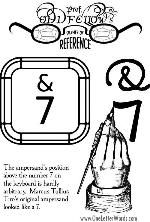
Prof. Oddfellow’s Frames of Reference: Marcus Tullius Tiro’s original ampersand
a nice abbreviated online history of graphic design
 Check this out: a nice abbreviated online history of graphic design from Nancy Stock-Allen, who teaches the subject at The University of the Arts in Philadelphia.
typographic correctness
“The practicabillity of a type selection is as vital to typographic correctness as distinctive ‘atmosphere.’ An inharmonious color tone, a misfit size, an illegibility in mass, will transform the most appropriate ‘feeling’ into the most incongruous effect.’”
—Frederic Dannay, How to Use Modern Display Types, 1931; quoted by Steven Heller and Louise Fili in Typology: Type Design from the Victorian Era to the Digital Age, 1999.
grey matter
“Type should be read. Too often . . . type is referred to as color. This is not wrong in itself, but leads to the next step which is to regard it as some grey matter which in turn can be cut up with scissors.”
—Erik Nitsche, quoted by Steven Heller and Louise Fili in Typology: Type Design from the Victorian Era to the Digital Age, 1999.
A typical Dada design
“Columns of justified and ragged type often were skewed beyond
conventional margins; multiple type weights and faces from different
type families were used unharmoniously in a single composition; and
hot-metal type material (heavy rules and stock illustrations) were
strewn willy nilly throughout the pages. A typical Dada design looked,
in printer’s terms, like the contents of a hellbox (a receptacle for
smashed and broken type bodies).”
—Steven Heller and Louise Fili, Typology: Type Design from the Victorian Era to the Digital Age, 1999.
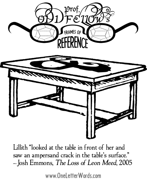
Prof. Oddfellow’s Frames of Reference: an ampersand crack in the table’s surface
the golden age of typography
“The meaningless lines or excrescences upon which so many modern
designers, wthout ability to reach the higher beauties, rely, in their
endeavor to conceal their lack of genius or taste, were never present
in the type of the golden age of typography.”
—Frederic Goudy, The Art in Type Design, 1912; quoted in Typology: Type Design from the Victorian Era to the Digital Age
by Steven Heller and Louise Fili, 1999. They add: “The golden age of which he
speaks is the sixteenth century, when some of the classic ‘humanist’
faces (Bodoni, Garamond, Jensen) were introduced.”