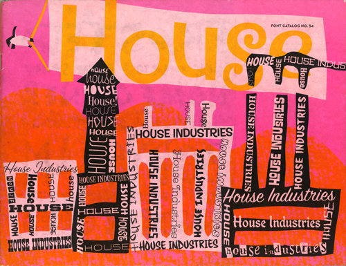
The new House Industries catalog is out, and it’s a beauty. I like it because its bright and fun, and because it’s more evidence of a design trend that has been called (by me) a primitive revolution, a new trend in graphic design that distances itself from the slick perfectionism of the mainstream and also avoids the dominant reaction against this, the rebellious ‘cult of the ugly’ that is perhaps best exemplified by the recently unveiled London 2012 Olympics logo.

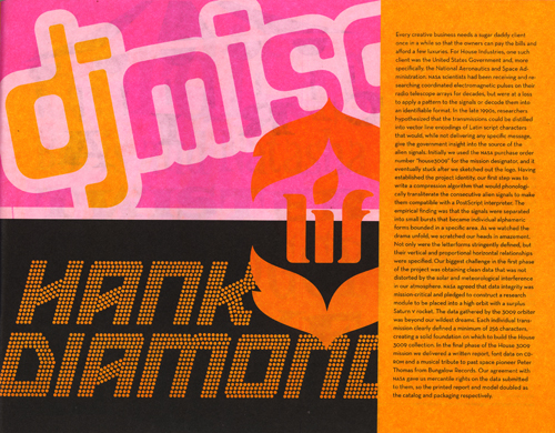
House Industries is at its best here, combining a respect for vernacular sign painting and a human touch with a sense of whimsy and humor to great effect. But perhaps the most impressive moment in this 80 page book occurs on page 27. Could it be? Yes, it’s the DJ Misc logo, designed by Tal Leming in Outerspace!
Outerspace is the name of the font. Tal, its down-to-earth designer, was once a student of mine at LSU. He freelances for House Industries now, and I suspect that he designed much of this catalog. If so, congratulations Tal, on a job well done. And thank you for the continuing free publicity.
Tal has informed me that he did not help design the catalog after all. In his words:
“Ms. Bondé Prang designed it all. The colors were probably selected by Andy Cruz. Rich Roat probably wrote the semi-reality based text. Me? I got it in the mail just like everyone else.”