 The
The
ideal typographic color is an even grey that can be better seen
when you
slightly squint your eyes at a page of type. Typographic rivers are, of
course, the vertical ribbons of white space that sometimes appear by
happenstance in a column of type. They are hell on typographic color.
Rivers are most common in newspapers, which often have narrow columns
and tight deadline. The problem with rivers is that they draw your
attention away from the line of type that you were trying to read,
breaking your attention to the text. Call me silly, but I am
thinking that this post might be the first in a series that pays
respect to some of the great typographic rivers, a series I might call I’ve Known Rivers, Rivers I Have Known, or A River Runs Through It. I’m not sure what, but definitely a river pun.
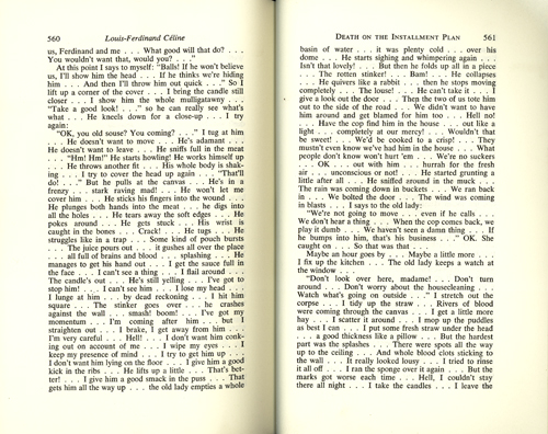
We’re starting with a good one, a doozie even: pages 560 and 561
of the 1966 english translation of Louis-Ferdinand Céline’s second novel, Death on the Installment Plan.
In the course of these childhood memoirs Céline comes to rely more and
more on the use of ellipsis, or suspension points, to capture the
actual process of thought and experience, an experiment that he
continued with increasing intensity for the rest of his career, to the
dismal of his book designers, and perhaps even a large percentage of
his readers. But Céline was a genius! You could definitely argue that
his disruptive rivers are appropriate here, that they add emphasis to
the violent and deliberately shocking text in the same way that
futurist F.T. Marinetti’s concrete poetry described the violence of a
modern battlefield. Bravo Céline! This A River Runs Though It moment is
for you!
A River Runs Through It: Death on the Installment Plan
One thought on “A River Runs Through It: Death on the Installment Plan”
Leave a Reply
You must be logged in to post a comment.
The typographic river on page 560 even has an oxbow lake!