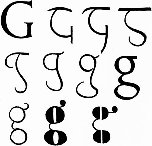
“Figure
3 (1-8) shows the evolution of the lower-case g from the Roman
original. 9-11 are comic modern varieties having more relation to pairs
of spectacles than to lettering—as though the designer had said: A pair
of spectacles is rather like a g; I will make a g rather like a pair of
spectacles.”
—Eric Gill, An Essay on Typography, 1936.
dude, dudette – nice job on the migration. -jb
Well thank you. It’s a gradual process, but I think it’s looking better too.