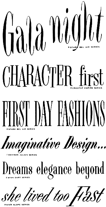
Please enjoy for a few moments the luxurious lettering of a time
gone by. . . . I noticed while I was assembling the previous post that
my selections
tended towards the cleaner, more ‘progressive’ international style that
would come to prominence in the United States in the 1960s. This bolder
and squarer
modern style is actually rather scarce in the catalog, which, in
general, fairly revels in the flair for frippery that the ’50s are
famous for. So here’s a second helping of specimens from the same
1955 Photo-Lettering catalog.
she lived too Fast
One thought on “she lived too Fast”
Leave a Reply
You must be logged in to post a comment.
The 1955 PLINC catalog is incredible. The legend is that PLINC was competing with another photo-typesetting service in NYC and the catalogs were the primary weapons in the war. Each time PLINC would release a new catalog, the other company would release a catalog that was slightly bigger than the PLINC catalog. So, PLINC decided to go thermonuclear and they made a HUGE catalog in 1955. I’ve heard stories that it was so big that it didn’t fit on the bookshelves in the studios, so the plan kind of backfired.
It is a pretty rare specimen. House Industries has a copy and I’ve spent many hours staring at it. It is one of the most beautifully designed specimen books I’ve seen. Each and every page is a carefully orchestrated explosion of headlines. That is a really tricky thing to pull off now, so I can’t imagine how hard it was in the pre-computer days.
The 1950 catalog is equally lovely, if not quite as gargantuan, and much easier to find. Design nerd note: the cover and specimen page template of the 1950 catalog was designed by Alex Steinweiss.
Incidentally, if you want to see some superb examples of mid-twentieth century lettering, look at the books by Mortimer Leach. I believe that Middleton has his “Lettering for Advertising” in general circulation. It has some gorgeous modern styles like the ones shown above.