The new House Industries catalog
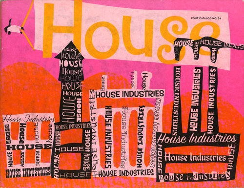
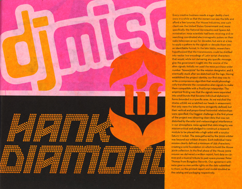
House Industries is at its best here, combining a respect for vernacular sign painting and a human touch with a sense of whimsy and humor to great effect. But perhaps the most impressive moment in this 80 page book occurs on page 27. Could it be? Yes, it’s the DJ Misc logo, designed by Tal Leming in Outerspace!
Outerspace is the name of the font. Tal, its down-to-earth designer, was once a student of mine at LSU. He freelances for House Industries now, and I suspect that he designed much of this catalog. If so, congratulations Tal, on a job well done. And thank you for the continuing free publicity.
diaphanous and precious and white
“Her Enlightenment is perfect,—‘And we are nothing, you and me’—she pokes at my chest, ‘Jew—Jew—’ (Mexican saying ‘You’) ‘—and me’—pointing at herself—‘We are nothing. Tomorrar we may be die, and so we are nothing—’ I agree with her, I feel the strangeness of that truth, I feel we are two empty phantoms of light or like ghosts in old haunted-house stories diaphanous and precious and white and not-there,—She says ‘I know you want to sleep.’”
—Jack Kerouac, Tristessa, 1960.
Mexico
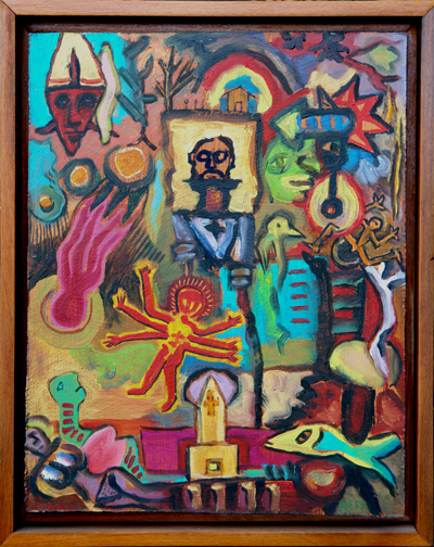
Charles Barbier & Paul Neff, Mexico, 2004, 12″x15″.
Petit Four
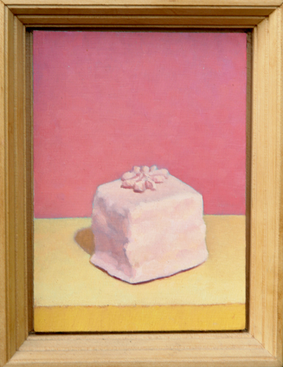
Tom Gregg, Petit Four, 1990, 5″x7″.
Japanese flowers
“He began reading the paper. The print swam and spread like Japanese flowers. Then it was sharp again, orderly, running in a smooth black and white paste over his orderly black and white brain.”
—John Dos Passos, Manhattan Transfer, 1925.
Dripping with a tango
“Dripping with a tango the roadhouse melted pink like a block of icecream.”
—John Dos Passos, Manhattan Transfer, 1925.
whitebright bluebright copperbright
“He was crumbling plaster with something that rattled achingly in his chest, she was an intricate machine of sawtooth steel whitebright bluebright copperbright in his arms.”
—John Dos Passos, Manhattan Transfer, 1925.
pistachiogreen bubbles of twilight
“They are walking up the Mall in Central Park. . . .
She is walking in her wide hat in her pale loose dress that the wind now and then presses against her legs and arms, silkily, swishily walking in the middle of great rosy and purple and pistachiogreen bubbles of twilight that swell out of the grass and trees and ponds, bulge against the tall houses sharp and gray as dead teeth round the southern end of the park, melt into the indigo zenith.”
—John Dos Passos, Manhattan Transfer, 1925. My spellchecker is going crazy here! Dos Passos was an influence on Jack Kerouac and it shows. They both made up new words whenever they needed them. So did Shakespeare!
a primitive revolution
 There
There
are signs in the graphic design community of a reaction against the
slick digital look of ”the future“ that I am going to call a primitive
revolution. This low-budget hand-rendered look “works” because it
stands out from the pre-processed competition. It is visually startling
and often witty and refreshing. Art directors like the primitive
revolution because it is effective, at this point in time, in the
marketplace. Graphic designers like the primitive revolution because it
raises interesting questions about our culture’s values, because it
reaffirms their humanity, and because it’s fun.
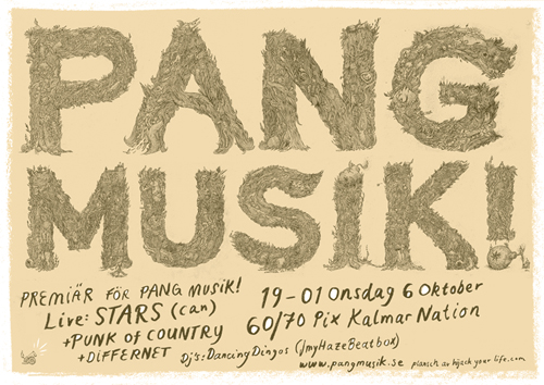
I mention all this because of a website that I ran into today: Hijackyourlife.com. Hijackyourlife and Hand Job: A Catalog of Type,
are two of the fullest expressions of this primitive revolution that I
know. One of them comes the Netherlands and the other from the United
States. It it too much to think that this intensely personal revolution
may be occurring internationally? (Thank you Johnny B for the brilliant link.)
40+ Excellent Freefonts
By student demand, here is a link to the article at SmashingMagazine.com entitled 40+ Excellent Freefonts For Professional Design. (ATTENTION STUDENTS: Please choose and use these fonts with care. There are some good typefaces here, and perhaps some great ones, but I think the word ‘excellent’ in this context may be a slang appeal to youth culture, or the youth market, and does not necessarily connote excellence in the classic typographic sense of preeminence. In other words, you may have to pay for your preeminent fonts.) (Thank you Bryan Briggs.)