the manuscripts of the snow
“Great snowstorms overtook them. In Missouri, at night, Neal had to drive with his scarf-wrapped head stuck out the window with snowglasses that made him look like a monk peering into the manuscripts of the snow because the windshield was covered with an inch of ice.”
—Jack Kerouac, On the Road: The Original Scroll, 2007.
real mental power kicks
“Benny, tea, anything I KNOW none as good as coffee for real mental power kicks.”
—Jack Kerouac, in a 1951 letter to Neal Cassady; quoted by John Leland in Why Kerouac Matters, 2007.
the beautiful dream of life
“More and more as I grow older I see the beautiful dream of life expanding till it is much more important than gray life itself—a dark, red dream the color of the cockatoo.”
—Jack Kerouac, Journal, July 4, 1949; quoted by John Leland in Why Kerouac Matters, 2007.
Vernacular Baton Rouge
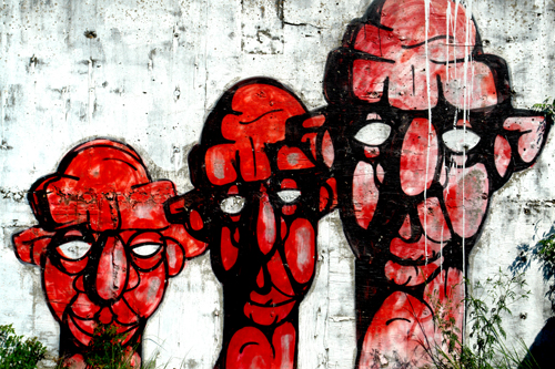
We in graphic design call the graffiti and hand painted signage of a given area “the vernacular.” And I have been impressed for years by the vernacular here in Baton Rouge. I don’t know how many times I’ve said to myself “I should take a picture of that.” So here it is, the first in a series. These unsigned heads face River Road just south of the I-10 bridge.
the full moon
“‘So there was a old woman told my mammy once that if a woman showed her belly to the full moon after she had done caught, it would be a gal.’”
—William Faulkner, Spotted Horses, 1940.
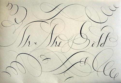
Bernard Maisner
Niels “Shoe” Meulman
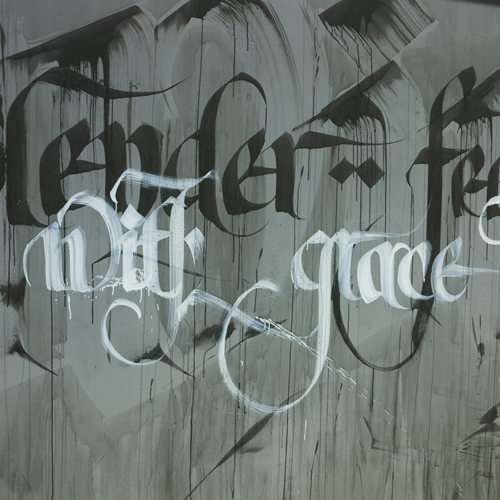
Niels “Shoe” Meulman is a Dutch graffiti artist, graphic designer, and calligrapher. He started tagging at the age of 16. Now he’s 40 and his work is amazing. Click here to see his portfolio, which is worth checking out. And click here to watch a four-part interview with him on YouTube.
The Caroline miniscule
“Although by some reports he was illiterate except to sign his name, Charlemagne fostered a revival of learning and the arts. The England of the 700s had seen much intellectual activity, and Charlemagne recruited the English scholar Alcuin of York to come to his palace at Aachen and establish a school. . . . Many manuscripts were difficult, if not impossible, to read. Charlemagne mandated reform by royal edict in A.D. 789. . . .
Efforts to reform the alphabet succeeded. For a model, the ordinary writing script of the late antique period was selected [and] combined with Celtic innovations, including the use of four guidelines, ascenders, and descenders. . . . The Caroline miniscule is the forerunner of our contemporary lowercase alphabet. . . . Roman capitals were studied and adopted for headings and initials. . . . The use of a dual alphabet was not fully developed in the sense that we use capital and small letters today, but a process in that direction had begun.”
—Phil Meggs & Alston Purvis, Meggs’ History of Graphic Design, 2006.
The codex
“The codex, a revolutionary design format, began to suplant the scroll (called a rotulus) in Rome and Greece, beginning about the time of Christ. Parchment was gathered in signatures of two, four or eight sheets. These were folded, stitched, and combined into codices with pages like a modern book. . . .
Christians sought the codex format to distance themselves from the pagan scroll; pagans clung to their scrolls in resistance to Christianity. Graphic format thereby became a symbol of religious belief during the late decades of the Roman Empire.”
—Phil Meggs & Alston Purvis, Meggs’ History of Graphic Design, 2006.
The Latin alphabet
“The Latin alphabet came to the Romans from Greece by way of the ancient Etruscans, a people whose civilization on the Italian peninsula reached its height during the sixth century B.C. After the letter G was designed by one Spurius Carvilius (c. 250 B.C.) to replace the greek letter Z (zeta), which was of little value to the Romans, the Latin alphabet contained twenty-one letters: A, B, C, D, E, F, G, H, I, K, L, M, N, O, P, Q, R (which evolved as a variant of P), S, T, V, and X. Following the Roman conquest of Greece during the first century B.C., the Greek letters Y and Z were added to the end of the Latin alphabet because the Romans were appropriating Greek words containing these sounds. . . .
Roman inscriptions were designed for great beauty and permanence. The simple geometric lines of the capitalis monumentalis (monumental capitals) were drawn in thick and thin strokes, with organically unified straight and curved lines. Each letterform was designed to become one form rather than merely the sum of its parts. Careful attention was given to the shapes of spaces inside and between the letters. . . .
Regardless of which tool initiated the serif as a design element, we do know that the original letters were drawn on the stone with a brush and then carved into it. The shapes and forms defy mathematical analysis or geometrical construction. . . . Some Roman Inscriptions . . . contain minute particles of red paint that have adhered to the stone through the centuries, leaving little doubt that the carved letters were painted with red pigment.”
—Phil Meggs & Alston Purvis, Meggs’ History of Graphic Design, 2006.