Surf Icing
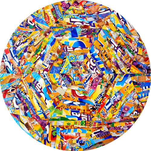
shrieking and blaspheming colors
“The twins were wet and tired, and they proceeded to undress without
any preliminary remarks. The abundance of sleeve made the
partnership-coat hard to get off, for it was like skinning a tarantula;
but it came at last, after much tugging and perspiring. The mutual vest
followed. Then the brothers stood up before the glass, and each took
off his own cravat and collar. . . . Each cravat, as to color, was in
perfect taste, so far as its owner’s complexion was concerned—a
delicate pink, in the case of the blonde brother, a violent scarlet in
the case of the brunette—but as a combination they broke all the laws
of taste known to civilization. Nothing more fiendish and
irreconcilable than those shrieking and blaspheming colors could have
been contrived.”
—Mark Twain, Those Extraordinary Twins, 1894.
an abecedary
scientific fatalism
“First, I found the whole modern world talking scientific fatalism; saying that everything is as it must always have been, being unfolded without fault from the beginning. The leaf on the tree is green because it could never have been anything else. Now, the fairy-tale philosopher is glad that the leaf is green precisely because it might have been scarlet. He feels as if it had turned green an instant before he looked at it. He is pleased that snow is white on the strictly reasonable ground that it might have been black. Every colour has in it a bold quality as of choice; the red of garden roses is not only decisive but dramatic, like suddenly spilt blood. He feels that something has been done. But the great determinists of the nineteenth century were strongly against this native feeling that something had happened an instant before. In fact, according to them, nothing ever really had happened since the beginning of the world. Nothing ever had happened since existence had happened; and even about the date of that they were not very sure.”
—G.K. Chesterton, Orthodoxy, 1908.
a single jewel
“For the universe is a single jewel, and while it is a natural cant to talk of a jewel as peerless and priceless, of this jewel it is literally true. This cosmos is indeed without peer and without price: for there cannot be another one.”
—G.K. Chesterton, Orthodoxy, 1908.
The great synthesizer
“The great synthesizer who alters the outlook of a generation, who suddenly produces a kaleidoscopic change in our vision of the world, is apt to be the most envied, feared, and hated man among his contemporaries. Almost by instinct they feel in him the seed of a new order; they sense, even as they anathematize him, the passing away of the sane, substantial world they have long inhabited. Such a man is a kind of lens or gathering point through which past thought gathers, is reorganized, and radiates outward again into new forms.”
—Loren Eiseley, The Night Country, 1971. Sir Isaac Newton (see below) was such a man.
Apple’s original logo
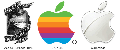 “Did you know that Apple’s original logo was Isaac Newton under an apple tree? Or that Nokia’s original logo was a fish?” Check out The Evolution of Tech Companies’ Logos, an exploration of the subject at Neatorama.
The most important letter forms
“The most important letter forms used today arose in four rather similar periods: In classical antiquity the roman capital alphabet developed, the Carolingian Renaissance gave us our minuscule characters, the Quattrocento created Old Face and the unity of capitals and lowercase small letters as well as the corresponding italic, and our Modern Face originated in neo-Classicism. These are obviously quite progressive periods in which a new class or group gained authority and influence in the cultural life of its country; they were periods in which education, books and reading continued to be supported by state institutions.”
—Albert Kapr, The Art of Lettering; The History, Anatomy, and Aesthetics of the Roman Letter Forms, 1983.
one of the most important formal problems in the entire history of lettering
“[A]nother characteristic of Old Face [Old Style] is to be noted. All earlier scripts were single alphabet scripts. Only occasionally were larger letters from another script used as initials. Renaissance lettering paves the way for the two-alphabet script. The fact that our present alphabet goes back to two alphabets which date from different periods and are the outcome of different intellectual and technical conditions is essentially one of its drawbacks. The humanistic minuscule was originally a copy of the Carolingian minuscule, the versals a copy of the Roman capitals or Carolingian copies of them. The resulting dualism has never been overcome and is one of the most important formal problems in the entire history of lettering.”
—Albert Kapr, The Art of Lettering; The History, Anatomy, and Aesthetics of the Roman Letter Forms, 1983. Title page by Arkadia Trojankew, Moscow, 1972.
printed material
“[C]ertain qualities are inherent in all printed material. A sans serif seems cool, austere, objective, sober; . . . display sans serif is more natural and less rational, futura, on the other hand, intellectual and distinguished, Gill sans is harmonious in expression. . . . Bodoni is characterized by its classical harmony, Walbaum by a certain respectability and Didot by esprit. Jenson Roman was and is valued for its distinguished simplicity, noble proportions, readability and strength as one of the most beautiful faces of the Renaissance. Garamond by comparison is attractive through its elegance and lightness, which in Garamond italic is transformed into a delightful gracefulness. Caslon roman is self-assured, self-confident and full of Baroque independence; it is more original than Baskerville which is similar in spirit; Baskerville is however more concerned with beauty and harmony. It is not only the classical types which evoke emotions, modern typefaces can have this effect also.”
—Albert Kapr, The Art of Lettering; The History, Anatomy, and Aesthetics of the Roman Letter Forms, 1983.