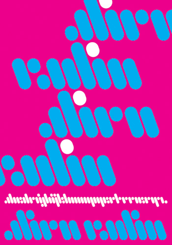
 It didn’t make the preceding top 100 list, but here’s my best schrift, my only schrift actually: Alien Radio, a font that I designed about ten years ago with a lot of help from Tal Leming. It was inspired by the Warner Brothers cinematic w logo, but at least I admit it. Functional? Probably not. A.R. takes the fun right out of functional. When a precise literal rendering of a text is essential to your communication, Alien Radio will probably not be your best font choice. But when you want to be cryptic and cool, post-modern to the point of invisibility; when you want to suggest communication without referencing anything specific, when legibility hardly matters anyway—consider A.R.
A.R.
Leave a Reply
You must be logged in to post a comment.