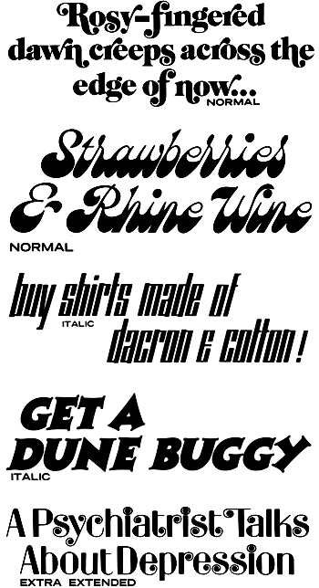
Some more type specimens from the 1969 LetterGraphics catalog of the previous post. The typefaces are Arriola Caslon Swash, Brandywine, Stein Long, Charlie Pointed, and, Spring. I particularly like the use of Spring in the faux-headline about depression. It’s a hopeful touch. I recognize a lot of the fonts in this catalog ffrom greeting cards; 1969 must have been a watershed year for greeting cards. If you consider that in 1969 Rod McKuen (available now in every thirft store) was by far America’s best-selling poet, it all starts to make a kind of crazy sense.
GET A DUNE BUGGY
Leave a Reply
You must be logged in to post a comment.