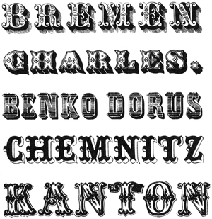
 “With the intention of creating something eccentric, the Tuscan or Toscanienne types were . . . cut first in England. It is characterized by serifs forked in the middle some of them bent outwards in a sickle shape. Competition among the typefoundries was responsible for more and more new variants and so mixtures of Tuscan and Clarendon, Italian, bold Roman and sans serif sprang from an imagination lacking in artistic judgment. Sometimes the top half of the characters of Tuscan was simply joined to the bottom part of an Egyptian the result being a type which might possibly be called curious or interesting, unfortunately often it was just tasteless. . . .
All the typefaces of the first decades of the 19th century which we have been discussing here, bold roman, Egyptian, Tuscan, sans serif were brought on to the market in many different decorative variations. Light, engraved, plastic, ornamental, shaded and many other variations were invented, mostly without artistic merit.”
—Albert Kapr, The Art of Lettering; The History, Anatomy, and Aesthetics of the Roman Letter Forms, 1983. Ornamental versals by Schelter, Leipzig 1847.