The colors are inside our brains
“A mysterious aspect of color is that it is created in the brain and seen to exist in the physical environment. But the physical environment contains only light waves and is in fact colorless. The colors are inside our brains, not outside.”
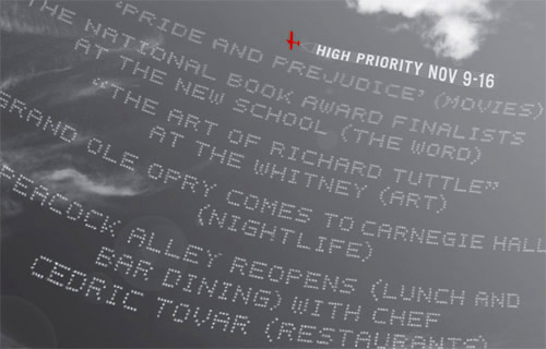
HIGH PRIORITY
seeing letters in color
“[T]he most commonly reported type of synesthesia is hearing or seeing letters in color. Vowels, and often consonants, too, have very specific—and fixed—colors for the synesthetes who see letters in color. For the synesthete Katinka Regtien, for example, the vowel E is not simply red but a specific translucent red with a hint of orange. . . .
the Glass Bead Game
“[The] rules, the sign language and grammar of the Game, constitute a kind of highly developed secret language drawing upon several sciences and arts, but especially mathematics and music (and/or musicology), and capable of expressing and establishing interrelationships between the content and conclusions of nearly all scholarly disciplines. The Glass Bead Game is thus a mode of playing with the total contents and values of our culture; it plays them as, say, in the great age of the arts a painter might have played with the colors on his palette. All the insights, noble thoughts, and works of art that the human race has produced in its creative eras, all that subsequent periods of scholarly study have reduced to concepts and converted into intellectual property—on all this immense body of intellectual values the Glass Bead Game player plays like the organist on an organ.”
—Hermann Hesse, The Glass Bead Game (Magister Ludi), 1943.
A River Runs Through It: Death on the Installment Plan
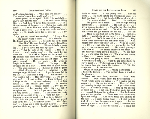 The
The
ideal typographic color is an even grey that can be better seen
when you
slightly squint your eyes at a page of type. Typographic rivers are, of
course, the vertical ribbons of white space that sometimes appear by
happenstance in a column of type. They are hell on typographic color.
Rivers are most common in newspapers, which often have narrow columns
and tight deadline. The problem with rivers is that they draw your
attention away from the line of type that you were trying to read,
breaking your attention to the text. Call me silly, but I am
thinking that this post might be the first in a series that pays
respect to some of the great typographic rivers, a series I might call I’ve Known Rivers, Rivers I Have Known, or A River Runs Through It. I’m not sure what, but definitely a river pun.
We’re starting with a good one, a doozie even: pages 560 and 561
of the 1966 english translation of Louis-Ferdinand Céline’s second novel, Death on the Installment Plan.
In the course of these childhood memoirs Céline comes to rely more and
more on the use of ellipsis, or suspension points, to capture the
actual process of thought and experience, an experiment that he
continued with increasing intensity for the rest of his career, to the
dismal of his book designers, and perhaps even a large percentage of
his readers. But Céline was a genius! You could definitely argue that
his disruptive rivers are appropriate here, that they add emphasis to
the violent and deliberately shocking text in the same way that
futurist F.T. Marinetti’s concrete poetry described the violence of a
modern battlefield. Bravo Céline! This A River Runs Though It moment is
for you!
The new House Industries catalog
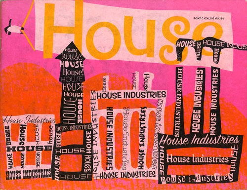
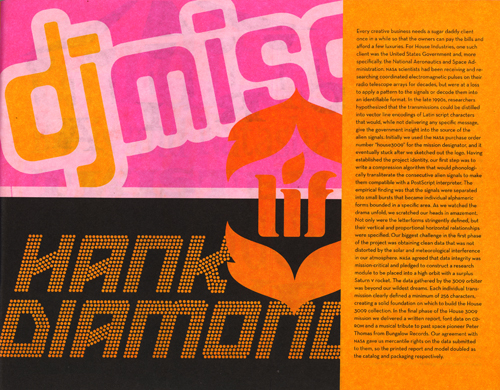
House Industries is at its best here, combining a respect for vernacular sign painting and a human touch with a sense of whimsy and humor to great effect. But perhaps the most impressive moment in this 80 page book occurs on page 27. Could it be? Yes, it’s the DJ Misc logo, designed by Tal Leming in Outerspace!
Outerspace is the name of the font. Tal, its down-to-earth designer, was once a student of mine at LSU. He freelances for House Industries now, and I suspect that he designed much of this catalog. If so, congratulations Tal, on a job well done. And thank you for the continuing free publicity.
diaphanous and precious and white
“Her Enlightenment is perfect,—‘And we are nothing, you and me’—she pokes at my chest, ‘Jew—Jew—’ (Mexican saying ‘You’) ‘—and me’—pointing at herself—‘We are nothing. Tomorrar we may be die, and so we are nothing—’ I agree with her, I feel the strangeness of that truth, I feel we are two empty phantoms of light or like ghosts in old haunted-house stories diaphanous and precious and white and not-there,—She says ‘I know you want to sleep.’”
—Jack Kerouac, Tristessa, 1960.
Mexico
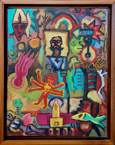
Charles Barbier & Paul Neff, Mexico, 2004, 12″x15″.
Petit Four
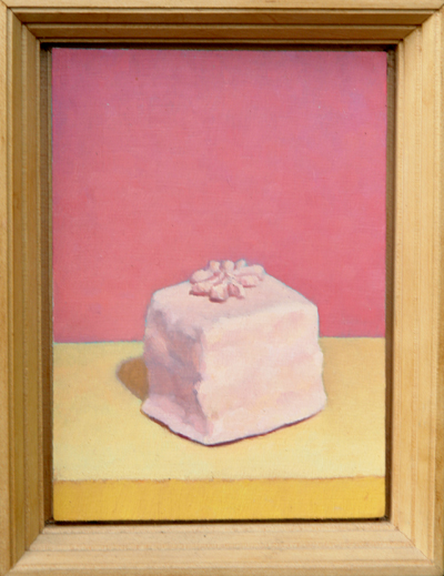
Tom Gregg, Petit Four, 1990, 5″x7″.
Japanese flowers
“He began reading the paper. The print swam and spread like Japanese flowers. Then it was sharp again, orderly, running in a smooth black and white paste over his orderly black and white brain.”
—John Dos Passos, Manhattan Transfer, 1925.