Life with Letters
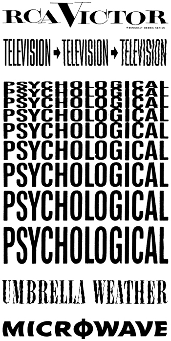
These type specimens were gathered from an 18-page reproduction of a 1955 Photo-Lettering catalog in Life with Letters, as they turned photogenic by
Edward Rondthaler, 1981. In 1955, as Ed puts it, ‘[p]hotographic lettering
was still so new that many art directors were unaware of its potential
or skeptical of its viability.’ Nevertheless, photo-typesetting proved
to be that medium that carried a tradition of typographic excellence from the era of metal type into
the digital age.
a sparkling with rings
“‘Now, missis, she wanted me to do dis way, and she wanted me to do dat way; and finally I got kinder sarcy, and says I, “Now, missis, do jest look at dem beautiful white hands o’ yourn, with long fingers, and all a sparkling with rings, like my white lilies when de dew’s on ’em; and look at my great black stumpin’ hands. Now, don’t ye think dat de Lord must have meant me to make de pie-crust, and you to stay in de parlour?”’”
—Harriet Beecher Stowe, Uncle Tom’s Cabin, 1852.
The symbol-making function
“The symbol-making function is one of man’s primary activities, like
eating, looking, or moving about. It is the fundamental process of the
mind, and goes on all the time.”
—Susanne K. Langer; quoted in Language in Thought & Action by S.I. Hayakawa, 1940.
the use of symbols
“Man’s achievements rest upon the use of symbols.”
—Alfred Korzybski; quoted in Language in Thought & Action by S.I. Hayakawa, 1940.
Words forming thought and vice versa
Words forming thought and vice versa, an illustration from Language in Thought & Action by S.I. Hayakawa, 1940.
A pair of spectacles is rather like a g
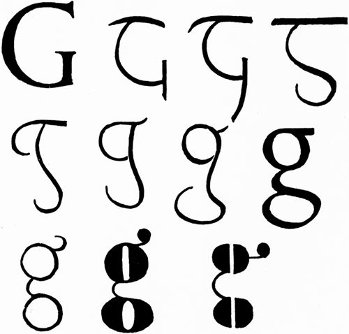
“Figure
3 (1-8) shows the evolution of the lower-case g from the Roman
original. 9-11 are comic modern varieties having more relation to pairs
of spectacles than to lettering—as though the designer had said: A pair
of spectacles is rather like a g; I will make a g rather like a pair of
spectacles.”
—Eric Gill, An Essay on Typography, 1936.
When is an A not an A?
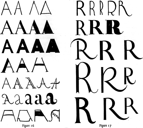 “Everybody thinks that he knows an A when he sees it; but only the few
extraordinary rational minds can distinguish between a good one & a
bad one, or can demonstrate precisely what constitutes A-ness. When is
an A not an A? Or when is an R not an R? It is clear that for any
letter there is some sort of norm. To discover this norm is obviously
the first thing to be done.”
—Eric Gill, An Essay On Typography, 1936.
a luxury market
“The traditional use of red for the commentary and ritual directions in ecclesiastical books and for the initial letters of more important passages is a reliable precedent where the customer is able to pay for it. At the present time only a few rich enthusiasts are prepared for such expense, with the consequence that such rubricating is only done in books printed for what may be called a luxury market.”
—Eric Gill, An Essay On Typography, 1936.
[T]he business of printed lettering
“[T]he business of printed lettering has, under the spur of commercial competition, got altogether out of hand and gone mad. There are now about as many different varieties of letters as there are different kinds of fools. I myself am responsible for designing five different sorts of sans-serif letters—each one thicker and fatter than the last because every advertisement has to try and shout down its neighbors.”
—Eric Gill, An Essay On Typography, 1936.