How should ‘sans’ be pronounced?
I posted yesterday’s question on a graphic design educators listserv, and I have already received three great responses. My question hasn’t been directly answered (which means it’s a good question, rIght?) but I have learned a great deal. There is more to the words serif and sans-serif than you might have expected. If you’re interested in such things and you have some time, check out How should ‘sans’ be pronounced”, a lively discussion of the subject at Typophile.com.
the word ‘serif’
I have been researching typographic terminology for an article I plan
to submit to a number of on- and off-line publishing houses. (Was that
vague enough?) According to the Oxford English
Dictionary, famous for its exhaustive word histories, the word
‘serif’ was a back formation from the word ‘sans-serif’. In
other words, serif was not, as I have always assumed, a French word,
but rather a ‘faux-french’ word invented in England just after the
English invention of ‘sans-serif.
According to the OED, the
words were first recorded in print in 1830 (serif) and 1841
(sans-serif). So it seems that serif came first, right? No,
actually. They are so close to each other biblio-geologically that
apparently the invention of the word ‘sans-serif’ led quite nicely to
the invention of the word serif.
My question now is
this: if there was no word ‘serif’, what word was previously used, in
any language, to describe what my first type teacher, P. Lyn Middleton,
called ‘the little feet on the letters’? It’s almost impossible
to believe that no one ever mentioned them. Sans-serif Roman type was,
amazingly, not invented until the mid-nineteenth century. For nearly
2000 years, if you wrote with the Roman alphabet, the serif was
literally ubiquitous!
Burma-Vita
So, aside from, perhaps, the color red, what’s Burmese about Burma-Shave? Did I hear you ask? Well, as Leonard Odell tells it in Frank Rowsome’s book The Verse by the Side of the Road, Burma-Shave was preceded as a family enterprise by a liniment or topical health aid developed by his grandfather and named by his father:
“We called it Burma-Vita. Burma because most of the essential oils in the liniment came from the Malay peninsula and Burma, and Vita from the Latin for life and vigor—the whole name meaning Life from Burma.”
It is unclear whether any of these particular essential oils made it into the shaving cream knows as Burma-Shave, the result of over 300 chemical experiments, but as a prefix for a product name, Burma- was alive!
Burma-Shave
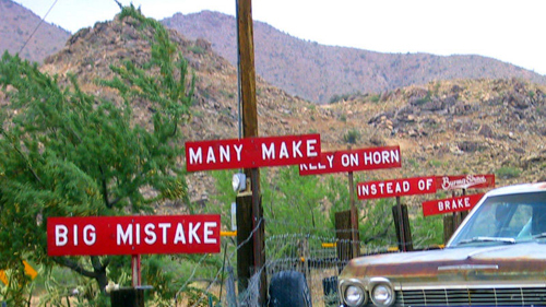
I don’t personally remember Burma-Shave signs; they were slightly before my time. But I’ve heard them mentioned from time to time and now I am researching all things Burmese for an upcoming lecture at school.
Burma-Shave signs were an advertising phenomenon, born as America’s highway system was growing. Rhyming sets of five painted boards with a kicker Burma-Shave logo on a sixth sign, they lined highways all over America through the 1930s, ’40s, and ’50s. The last of over 600 Burma-Shave jingles were posted in 1963.
Frank Rowsome Jr writes in his history of Burma-Shave signs, The Verse By the Side of the Road, “The signs themselves underwent continuous evolution. For the first five years they were one-inch pine boards, ten inches high and yard long, dip-painted twice with the background color mixed preservative. The lettering, a standard sign painter’s Gothic, was applied by silk screen. . . . To emphasize the new crop of jingles, signs alternated by years between red with white letterig and orange with black lettering. . . .
“Yearly alterations of color had seemed a good way to call attention to the new signs, but it was noticed that whenever people spoke of Burma-Shave signs, they invariably described them as red and white. Orange-and-black ones seem to have made no impression whatever on the public’s retina, or at least on its memory. At this the company gave up, going almost exclusively to red and white.”
Frank Rowsome Jr never mentions the original reason for the red and white color scheme, but a deep red is, unofficially, the national color of the country Burma (or Myanmar depending on which side of the political fence you’re on). But the red seemed right, to the designers of the original signs as well as the general public, which dismissed the orange signs as aberrations.
something to look at
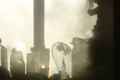
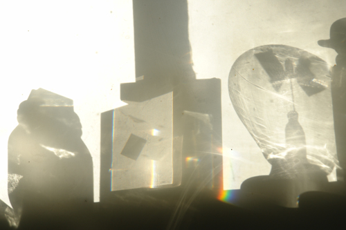
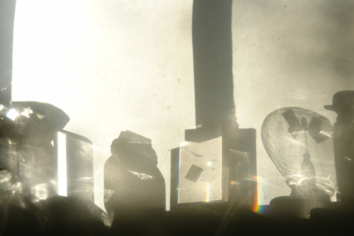

Just something to look at.
gray elephants
“Grandma was always out rustling . . . looking for white elephants at the auction rooms . . . she brought back everything, oil paintings, amethysts, whole forests of candelabras, cascades of embroidered tulle, cabochons, pyxes, stuffed animals, armor, parasols, gilded monstrosities from Japan, alabaster bowls and worse, gimcracks without a name, and objects nobody ever heard of. . . .
At the Passage she helped us as long as she could with what junk she still had left from her stock. We only lighted one window, that was as much as we could fill . . . It was a discouraging lot of bric-a-brac, decrepit with age, gray elephants, crap; if that was all we had to sell, we were sunk.”
—Louis-Ferdinand Céline, Death on the Installment Plan, Translated by Ralph Manheim, 1966.
back online!
After a week or so of inter-server confusion, DJ Misc is back online! The only bad news is that I lost all the pictures from the old server. They were so deeply embedded in the text, or something, that . . . well . . . they’re gone.
I know that many of you prefer pictures to text, I know that, so I’ll post some new pictures soon.
an historic moment

“I have been fortunate to witness several great moments in graphic design history, but none more overdue than the day The New York Times finally dropped the period from its masthead.
Newspaper mastheads traditionally placed a period
after the name, but by 1900 most papers had given up the practice. . . . Meanwhile, the period appeared day after day and week after week consuming ink, I estimate, at the rate of $84 a year.
It was not until 1966 that the Times concluded there
was little to be gained from further procrastination. . . .
The ailing masthead was brought into our quarters on
the appointed day. When the operating table was duly set Ed Benguiat,
after honing his trusted scalpel to a fine edge, administered four deft
strokes of the blade, severing the period with a minimum of discomfort.
. . .
It was an historic moment. . . . I hope we returned the severed period to the Times as a valuable contribution to its archives.”
—Edward Rondthaler, Life with Letters as they Turned Photogenic, 1981.
a media empire
Regular readers may have noticed that I haven’t posted anything new for three days. This is in anticipation of an upgraded site and a new server! I’ve been holding off on the latest entries because I want them to be beautiful and linkable. So, while it may seem that nothing much is happening here, big changes are coming.
From the new server I’ll be able to run up to 100 websites. Visions of a media empire are dancing in my head!
The letter M
“The letter M is identified by two independent but generally ascending and more or less symmetric lines joined at or very near their tips by the ends or near-ends of a more or less v-shaped and generally symmetric pair of lines whose crotch or point of convergence does not fall below the imaginary baseline.”
—Edward Rohdthaler, Life with Letters, 1981.