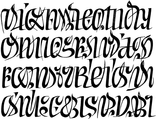
the flight of a bird or the gallop of a horse
“When reading we perceive lettering as the flight of a bird or the gallop of a horse. We are aware of these as a pleasing graceful phenomenon and do not see the limbs of these animals and their instantaneous positions in time. In lettering it is the complete line which is the most important thing.”
—Peter Behrens, 1902; quoted in The Art of Lettering; The History, Anatomy, and Aesthetics of the Roman Letter Forms, by Albert Kapr, 1983.
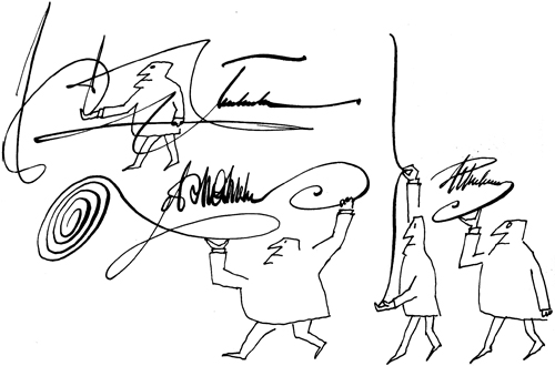
Saul Steinberg
aesthetic ideals
“The first simple writing tool was the human hand from which all other tools evolved. . . . The hand instructs the eye and the eye in turn corrects the hand which writes. So aesthetic ideas about lettering style grow out of the writing process. Cuneiform was developed by pressing a wedge-shaped reed into clay tablets, Roman capitals were shaped by the spatula and chisel. Papyrus and stylus were replaced by parchment and quill which enabled the clear distinction to be made between hair stokes and heavy strokes which characterizes typefaces in use today. . . . Cast type [printing] slowed down the process of change in the basic letter-forms as literacy spread. . . . Roman lettering became more precise while Black Letter became more lively and masterly. The copperplate technique used for reproducing the writing manuals of the Baroque period encouraged the contrast between thick and thin strokes in roman lettering. . . .
Copying religious texts was a sacred task and form of prayer for the monks of the Middle Ages; this was expressed in textura with its sacred aura. The serene freethinking of the humanists is reflected in Ranaissance italic. The type designers of the 20th century also had definite aims and aesthetic ideals.”
—Albert Kapr, The Art of Lettering; The History, Anatomy, and Aesthetics of the Roman Letter Forms, 1983.
the best legibility
“Black print on white or cream paper produces the best legibility. Negative type, that is, white type on a black background is 11% slower to read. Glossy, matt and coloured papers (red, green, pink and blue) reduce the legibility. Also lettering printed in different colours—red, green, white and blue print on white or coloured paper is a disadvantage.”
—Albert Kapr, summarizing previous research, The Art of Lettering; The History, Anatomy, and Aesthetics of the Roman Letter Forms, 1983.
a fleeting blue
“Are there people in Paris who consist only of sumptuous dresses, and are there houses that are only portals, and is it true that on summer days the sky over the city is a fleeting blue embellished only by little white clouds glued onto it, all in the shape of hearts?”
—Franz Kafka, Description of a Struggle, translated by Tania and James Stern. From Franz Kafka; The Complete Stories, 1971.
so-called moon
“‘“Thank God, moon, you are no longer moon, but perhaps it’s negligent of me to go on calling you so-called moon, moon. Why do your spirits fall when I call you ‘forgotten paper lantern of a strange color’?”’”
—Franz Kafka, Description of a Struggle, translated by Tania and James Stern. From Franz Kafka; The Complete Stories, 1971.
The Wish to Be a Red Indian
“If one were only an Indian, instantly alert, and on a racing horse,
leaning against the wind, kept on quivering jerkily over the quivering
ground, until one shed one’s spurs, for there needed to spurs, threw
away the reins, for there needed no reins, and hardly saw that the land
before one was smoothly shorn heath when horse’s neck and head would
already be gone.”
—Franz Kafka, The Wish to Be a Red Indian, in its entirety, translated by Willa and Edwin Muir. From Franz Kafka; The Complete Stories, 1971.
Edward Catich
the same ceiling
“I was just starting to doze off when something suddenly made me open my eyes again and stare up at the ceiling. I went on scrutinising the ceiling for some time, then sat up on the bed and looked around, the sense of recognition growing stronger by the second. The room I was now in, I realised, was the very room that had served as my bedroom during the two years my parents and I had lived at my aunt’s house on the borders of England and Wales. I looked again around the room, then, lowering myself back down, stared once more at the ceiling. It had been recently re-plastered and re-painted, its dimensions had been enlarged, the cornices had been removed, the decorations around the light fitting had been entirely altered. But it was unmistakably the same ceiling I so often stared up at from my narrow creaking bed of those days.”
—Kazuo Ishiguro, The Unconsoled, 1995.
God’s will
“Life is chaotic and unpredictable. If a butterfly flaps its wings in one part of the world, it could cause people at the opposite end of the globe to watch a Discovery Channel special on butterflies. And what’s on next? A show about tornadoes. Who made such a harrowing program schedule full of seemingly random destruction? It was God’s will.”
—Stephen Colbert, I Am America (And So Can You!), 2007.