The great synthesizer
“The great synthesizer who alters the outlook of a generation, who suddenly produces a kaleidoscopic change in our vision of the world, is apt to be the most envied, feared, and hated man among his contemporaries. Almost by instinct they feel in him the seed of a new order; they sense, even as they anathematize him, the passing away of the sane, substantial world they have long inhabited. Such a man is a kind of lens or gathering point through which past thought gathers, is reorganized, and radiates outward again into new forms.”
—Loren Eiseley, The Night Country, 1971. Sir Isaac Newton (see below) was such a man.
Apple’s original logo
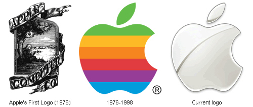 “Did you know that Apple’s original logo was Isaac Newton under an apple tree? Or that Nokia’s original logo was a fish?” Check out The Evolution of Tech Companies’ Logos, an exploration of the subject at Neatorama.
The most important letter forms
“The most important letter forms used today arose in four rather similar periods: In classical antiquity the roman capital alphabet developed, the Carolingian Renaissance gave us our minuscule characters, the Quattrocento created Old Face and the unity of capitals and lowercase small letters as well as the corresponding italic, and our Modern Face originated in neo-Classicism. These are obviously quite progressive periods in which a new class or group gained authority and influence in the cultural life of its country; they were periods in which education, books and reading continued to be supported by state institutions.”
—Albert Kapr, The Art of Lettering; The History, Anatomy, and Aesthetics of the Roman Letter Forms, 1983.
one of the most important formal problems in the entire history of lettering
“[A]nother characteristic of Old Face [Old Style] is to be noted. All earlier scripts were single alphabet scripts. Only occasionally were larger letters from another script used as initials. Renaissance lettering paves the way for the two-alphabet script. The fact that our present alphabet goes back to two alphabets which date from different periods and are the outcome of different intellectual and technical conditions is essentially one of its drawbacks. The humanistic minuscule was originally a copy of the Carolingian minuscule, the versals a copy of the Roman capitals or Carolingian copies of them. The resulting dualism has never been overcome and is one of the most important formal problems in the entire history of lettering.”
—Albert Kapr, The Art of Lettering; The History, Anatomy, and Aesthetics of the Roman Letter Forms, 1983. Title page by Arkadia Trojankew, Moscow, 1972.
printed material
“[C]ertain qualities are inherent in all printed material. A sans serif seems cool, austere, objective, sober; . . . display sans serif is more natural and less rational, futura, on the other hand, intellectual and distinguished, Gill sans is harmonious in expression. . . . Bodoni is characterized by its classical harmony, Walbaum by a certain respectability and Didot by esprit. Jenson Roman was and is valued for its distinguished simplicity, noble proportions, readability and strength as one of the most beautiful faces of the Renaissance. Garamond by comparison is attractive through its elegance and lightness, which in Garamond italic is transformed into a delightful gracefulness. Caslon roman is self-assured, self-confident and full of Baroque independence; it is more original than Baskerville which is similar in spirit; Baskerville is however more concerned with beauty and harmony. It is not only the classical types which evoke emotions, modern typefaces can have this effect also.”
—Albert Kapr, The Art of Lettering; The History, Anatomy, and Aesthetics of the Roman Letter Forms, 1983.
decorative variations
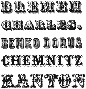 “With the intention of creating something eccentric, the Tuscan or Toscanienne types were . . . cut first in England. It is characterized by serifs forked in the middle some of them bent outwards in a sickle shape. Competition among the typefoundries was responsible for more and more new variants and so mixtures of Tuscan and Clarendon, Italian, bold Roman and sans serif sprang from an imagination lacking in artistic judgment. Sometimes the top half of the characters of Tuscan was simply joined to the bottom part of an Egyptian the result being a type which might possibly be called curious or interesting, unfortunately often it was just tasteless. . . .
All the typefaces of the first decades of the 19th century which we have been discussing here, bold roman, Egyptian, Tuscan, sans serif were brought on to the market in many different decorative variations. Light, engraved, plastic, ornamental, shaded and many other variations were invented, mostly without artistic merit.”
—Albert Kapr, The Art of Lettering; The History, Anatomy, and Aesthetics of the Roman Letter Forms, 1983. Ornamental versals by Schelter, Leipzig 1847.
the ‘black art’
“The praises of the discoverer of the ‘black art’ [Johann Gutenberg] continue to be sung right up to the present time. Mark Twain for instance says that the whole world acknowledges without hesitation that Gutenberg’s discovery was the greatest event known to man. . . .
Goethe said in 1820 . . . : ‘The art of printing is an event from which part two of the history of the world and of art may be dated, and one which is totally different from part one, and therefore we can no longer draw conclusions about the second part from the first.’”
—Albert Kapr, The Art of Lettering; The History, Anatomy, and Aesthetics of the Roman Letter Forms, 1983.
the Beautiful
“Of what shall we say that the Beautiful consist? Perhaps of two things in particular: harmony which satisfies the spirit by enabling it to recognize that all individual parts of a work are subordinated to a complete idea; it also consists of proportions which please the eye or rather the imagination, for the imagination contains within itself certain definite ideas or images, and the more that which is perceived coincides with them, the greater the pleasure one takes in it.”
—Giambattista Bodoni, from his Manuale Tipografico; quoted by Albert Kapr in The Art of Lettering; The History, Anatomy, and Aesthetics of the Roman Letter Forms, 1983.
Gothic scripts
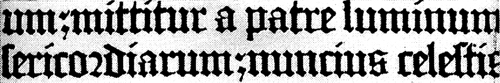 “The special feature of Gothic scripts is their verticality and the sense of reaching upwards is revealed most clearly in a comparison with Gothic architecture. Goethe said about this: ‘In its decoration German script is like Gothic buildings which draw the eye upwards and fill us with astonishment and admiration.’ The soaring tendency of Gothic cathedrals was intended to show believers their powerlessness in the face of the world beyond; the dark type surface of texture gives a foretaste of the sacred and the numinous in mysticism.”
—Albert Kapr, The Art of Lettering; The History, Anatomy, and Aesthetics of the Roman Letter Forms, 1983. The type is Textura by Johannes Numeister, 1457.
the white space between
“The distance between word and word should be as wide as an n, but the characters should not be placed together in such a way that the white space between is as large as the distance between the two verticals of the n.”
—Vincentino, 1522, on calligraphic letterspacing; quoted in The Art of Lettering; The History, Anatomy, and Aesthetics of the Roman Letter Forms, by Albert Kapr, 1983.